
Mayank Goel
30 June 2021 | 2 min read
Going through rows and rows of data in any file can be a tedious exercise. Converting that data into visualizations helps users to read the data, spot trends, and generally make the data ‘speak’ more clearly. In this column, I explain the steps taken to build a small interactive visual interface from the Governors of India Dataset, recently released by TCPD.
The first step consisted of picking the tools to plot the visualizations and build the dashboard. For the visualizations, I chose to use Plotly, which works well with Python and offers more flexibility than other open tools currently available. For example, there is in-built support for multiple axes, which is not available in other tools such as matplotlib. To turn our data scripts into shareable web content, we chose Streamlit, another open-source tool built specifically for Python (for a comparative analysis of Streamlit with similar tools, see this article).
Streamlit is an open-source Python library that makes the creation of web applications easy. It has built-in features for various tools and can integrate data from various popular visualization libraries. One drawback however is a slight lack of control of flow and flexibility of design and features. But the ease of use makes up largely for these small limitations. As such, Streamlit does not require any design experience, as it lays out the application by itself.
After going through the dataset’s documentation, we designed a basic dashboard, exporting
the data and predetermined visualizations in one web application to view. This required us to restructure the files in terms of Input/Output (I/O). The dataset was small and simple to understand, but it had a few intricacies. For instance, governors can at times be appointed across multiple states, which happens frequently. We needed to deal with repetitions for the visualizations so instead of using the string (direct representation) of the name, we used the unique ID which was already coded in the dataset.
Using Plotly for the visualizations themselves was fairly straightforward, and the challenges with Streamlit were soon resolved thanks to the dataset’s documentation. The main challenge was to work with all the little pieces of the project and incrementally develop the application.
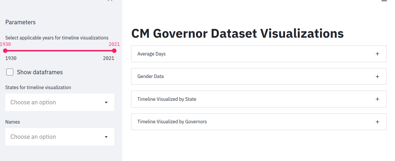
Fig 1: Layout of the Application
Fig.1 shows the layout we chose for the application. The main idea is to keep all parameters and controls on the left and to use the right side for expandable boxes.
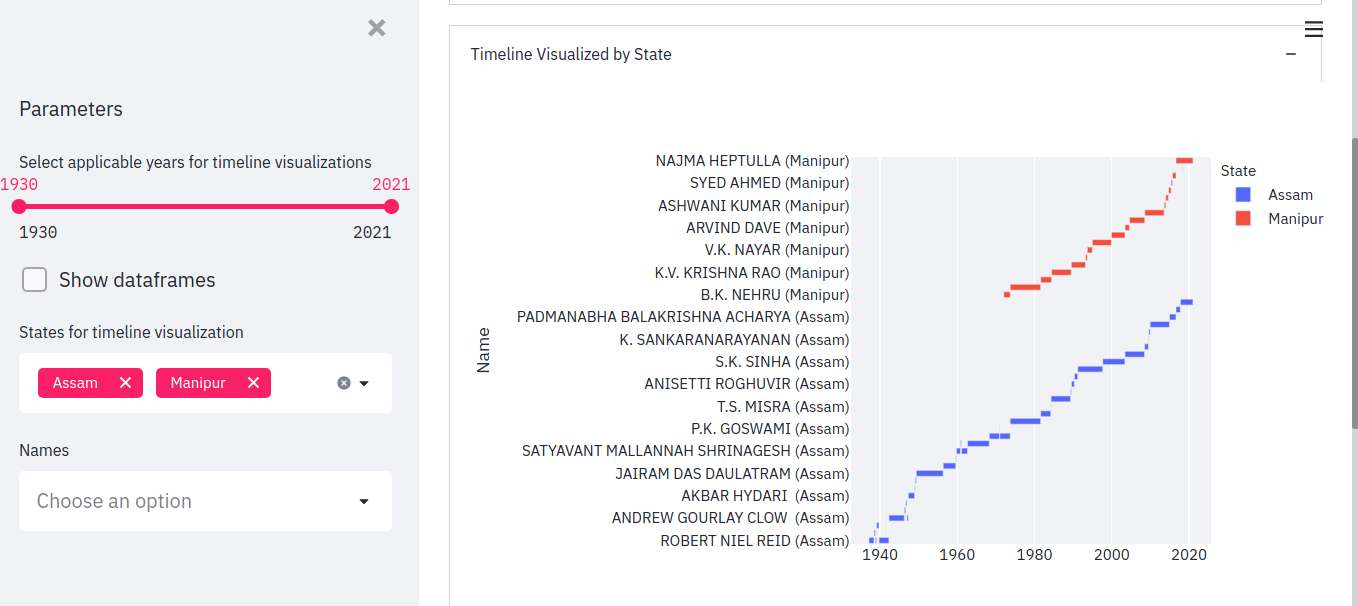
Fig 2: Timeline visualized by state
Here is a sample output, with the parameters from two states (Assam and Manipur). As one can see, the year is on the x-axis, and some Governors (Robert Niel Reid, the bottom-most name, for example) have multiple blocks, which denotes that they have served multiple terms.
Once you select your parameters, the visualization automatically appears on the right. Users can also hover on the blocks to get more information, such as the name and timeframe of a Governor. A zoom feature can also be added, to view all governors at once. This is a simple way to build effective and (hopefully) useful interactive data visualization. If you are interested in this particular dashboard, you will find the code in this GitHub repository.
About the author: Mayank Goel is a third-year undergraduate student at the International Institute of Information Technology, Hyderabad, studying Computational Linguistics. His research interests include discourse analysis and Applied Ethics. He currently interns at TCPD.
Acknowledgements: Thanks to Neelesh Agrawal and Mohit Kumar for their suggestions and help. I would also like to thank Gilles Verniers, Srishti Gupta, Priyamvada Trivedi and Ananay Agarwal for their feedback and help in writing this article.